Hastings Racecourse
BRAND IDENTITY / SOCIAL MEDIA
Founded in 1889, Hastings Racecourse is a long-standing Vancouver institution known for live thoroughbred racing and simulcast events from some of the world’s most prestigious tracks. While supported by a loyal base of long-time fans, the organization sought to broaden its audience and connect with younger, millennial visitors through a refreshed visual identity and a more engaging social media presence.


Refreshing the Brand
The project began with a review of Hastings’ existing brand, which lacked cohesive style guidelines and resulted in marketing materials that felt visually disconnected. To address this, I developed a comprehensive brand guide that redefined the visual system and provided clear direction for consistent application across platforms.
Updates were made to the brand’s colour palette, typography, and imagery to better reflect the energy and excitement of racing. The original maroon was replaced with a bright, vibrant red, frequently used in overlays to create a contemporary, high-impact look. League Gothic was selected as the primary display typeface and consistently set in bold italic, reinforcing themes of speed, motion, and competition.


Creating Engagement
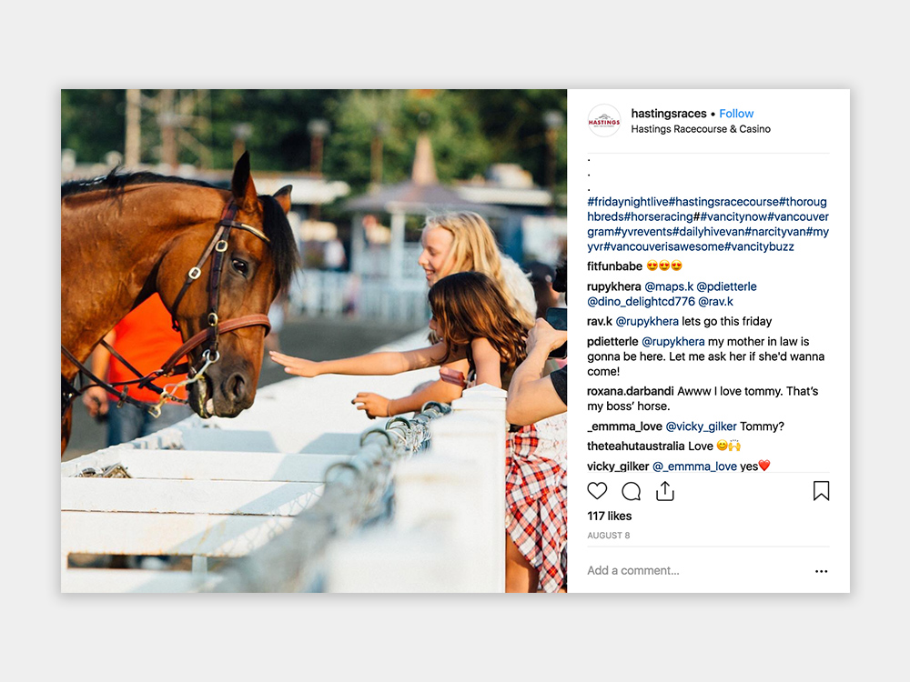
To strengthen the brand’s presence on social media, a professional photographer was engaged on select race days to capture dynamic imagery of both races and crowd moments. Instagram was identified as a key channel for reaching younger audiences, and the content strategy shifted away from text-heavy graphics toward a curated mix of high-quality photography, including race highlights, crowd scenes, special events, historical moments, and announcements.
Working closely with the social media team, I helped shape a more cohesive and visually engaging feed that better reflects the atmosphere of the racecourse and resonates with a new generation of visitors.