ARK CANADA
BRAND IDENTITY
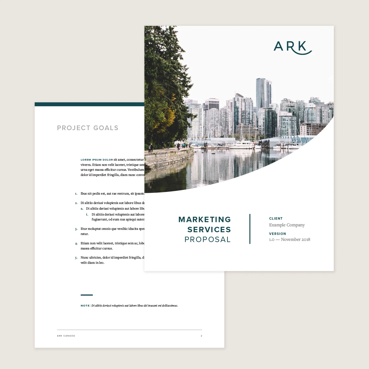
Ark Canada is a full-service digital marketing agency focused on revitalizing established brands and helping them connect with younger audiences. Operating at the intersection of strategy and execution, the agency needed a visual identity that could speak credibly to long-standing, traditionally minded clients while also expressing a fresh, contemporary point of view.
The Visual Identity
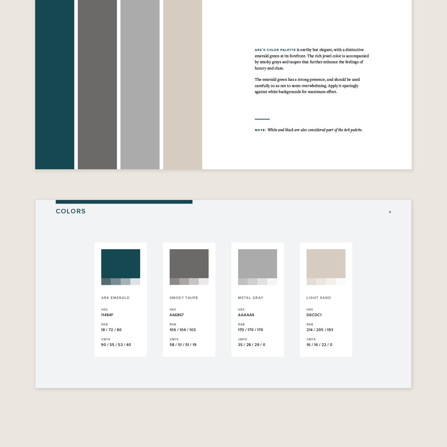
The design approach centered on balance. To differentiate Ark from the brightly colored aesthetic common among marketing agencies, the visual system was built around a deep emerald palette supported by warm, neutral taupes. Strong, geometric sans-serif typography was paired with a refined serif for body text, creating contrast while maintaining cohesion. The result is a visual identity that feels confident and modern, yet grounded and professional.


Supporting Deliverables
In addition to developing the core brand identity and guidelines, I designed a suite of practical templates to support day-to-day agency operations. These included letterhead, proposals, performance reports, and social media templates, ensuring the identity translated consistently across both client-facing and internal communications.